Mansions of madness is a unique game. Its mix of dungeon crawling, horror themes, exploration and unique scenarios, make it a really different experience to other games, and I feel it is the Arkham series game that best captures the feeling of the short stories. Usually, you cannot win by fighting the monsters and the game is best played when the investigators hurriedly run around in a panic to desperatly stop the horror before it overwhelms them.
And as you know, I paint my boardgames just to make the gaming experience cooler. My mantra with boardgames is to paint them well enough that they look ok on the table, but simple enough that it doesn't take a lifetime to paint. After all, they are paying pieces first and foremost.
However, for this project I had an extra set of criteria. Monsters in mansions have little data cards that you are mean't to slide in and out when you deploy a new one, as each card has different stats and specials on it. I find sliding those cards a pain in the butt, so I wanted every single monster in a group to be virtually indistinguishable from the others.
Note, I left the Mansions monsters box open and they got dusty. I'll sort that out at some point.
Take these maniacs as the first example. Yep, they are in a slightly different body position. But I did my absolute best effort to make sure the models looked as close as possible, right down to the blood spatter.
Also, another plug for GW's "blood for the blood god", it's simply the best "blood" material i've worked with in painting by miles. I love how it looks on the denim jeans, as that is how blood looks on jeans.
The cultists were painted as identically as possible. Normally I mix up race in my models, as I don't like seeing a swarm of white dudes only in all my games. But the setting, and the concept of "matching" didn't really work this time around.
The Shoggoth's got fully covered in a glossy sheen, but asides from that, they are basic black with a tiny bit of highlighting. The eyes are only real "painting" on the figures. It goes to show that even minimal effort can yeild fine looking models for table top play. You don't need a golden daemon sword quality figure for a boardgame to look a lot better.
I'm so so on these guys, but i'm really happy with how the human heads turned out. The key idea for the monsters, along with "matching" was to make them colourful and easily differentiated from other monsters. This is why I went with quite a vibrant colour palette over the whole series.
Of course, to balance out those bright colours, other figures got more homely looking schemes. The nightgaunt's in particular, are mentioned in the stories as being featureless. So i thought painting them a dull grey would work.
The zombies were another large batch that needed to match. I used some of the GW corrosion technical paint to give them a dirty look as well. A hate how they are all waving like gormless fans though. It's not a pose I would have chosen for them.
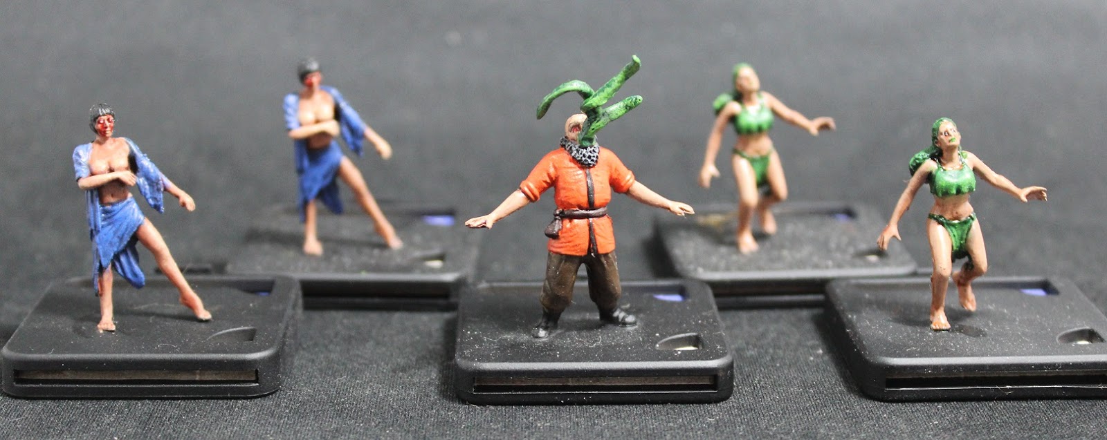
The wizard was my least favourite model in the range. He's just a bearded dude standing with his mouth open. I wanted him to be a little bit cooler, so I custom made some tentacles and put them growing out of his mouth. This way, instead of standing there gormlessly, he looks like he's about to explode and become a Dark Young.
Finally, my favourite models in the set, The Dark Young and the Crawling ones. The Dunwich Horror itself is an odd figure, the face and the tentacles are kinda cool. But the Dark young is such a nice figure, it feels very solid, as the plastic they use is a bit floppy on thinner parts like arms and weapons. He's just a big ball of awesome.
The crawling ones had more effort put into them than many of the other figures, because i like them so much. I used wet-blending on the torso to tentacle section, so it looks like the humanoid torso is organically growing out of the sludge at the bottom.
Total paint time for these figures was low, and the key was making them functionally good, rather than works of art. Virtually anyone can paint to this level with a small amount of practice. So I say again, don't be dissuaded from painting your games, even an average to mediocre paintjob is 100 times better than bare plastic.
Showing posts with label Mansions of Madness. Show all posts
Sunday, 19 July 2015
Thursday, 5 March 2015
Mansions of Madness - the characters
This is probably becoming old-hat to any regular reader, but i will reiterate, that you don't have to labor over models for ages to make them look "reasonable"
Boardgames look so much better with painted figures, even if those figures have only very simple paint schemes.
Case in point is these characters from the Arkham series of game, specifically, the ones from Mansions of Madness.
Now the cool thing about this is that these characters are usable in all four Arkham games. Arkam Horror, Elder Sign, Mansions and Eldritch Horror. Also, i purchased the pre-painted figures for all the characters no included in Mansions. So I have painted figures for all 48 odd characters in that family of games.
Which is pretty sweet
My usual "basic approach" of doing models quickly is repeated here. A solid base coat that is done in 2 layers normally to ensure coverage. An ink wash, so highlighting or dry-brushing, and a tiny amount of detail work.
The one tricky thing on these guys here, is the pin stripe suit. Now that is a basic job, it is literally some grey lines painted over the black undercoat. Nothing more complicated than that, but it looks surprisingly good.
The Harvey model on the left is a great example of the deception in my painting.
It looks like i meticulously highlighted the suit and did some fine detail work. The truth is that this is a two layer base coat + ink + drybrushing. Nothing more, and it took way less than 30 minutes to do. I was painting these guys in batches of 4, just to allow for drying time.
GW has some fabulous inks and you can see the "agrx earthshade" at work across the different browns i employed on these models. It is literally doing all the work for me.
I am also lazy enough to not remove the mold lines....... and it's really noticeable on Jenny on the far right.
Oh, and check out the "camoshade" ink on the green dress. That turned out really well.
So, i get back to the original point. Models for boardgames are pieces for the game first, and works of art second. They will suffer a lot of "wear and tear" so you don't need to be a Michelangelo for every paint job.
There is a lot to say about amazingly well painted models. But don't let expert painting put you off the notion that you can have "good" looking models with a small amount of time and practice. And good is great once they are on the board.
Boardgames look so much better with painted figures, even if those figures have only very simple paint schemes.
Case in point is these characters from the Arkham series of game, specifically, the ones from Mansions of Madness.
Now the cool thing about this is that these characters are usable in all four Arkham games. Arkam Horror, Elder Sign, Mansions and Eldritch Horror. Also, i purchased the pre-painted figures for all the characters no included in Mansions. So I have painted figures for all 48 odd characters in that family of games.
Which is pretty sweet
My usual "basic approach" of doing models quickly is repeated here. A solid base coat that is done in 2 layers normally to ensure coverage. An ink wash, so highlighting or dry-brushing, and a tiny amount of detail work.
The one tricky thing on these guys here, is the pin stripe suit. Now that is a basic job, it is literally some grey lines painted over the black undercoat. Nothing more complicated than that, but it looks surprisingly good.
The Harvey model on the left is a great example of the deception in my painting.
It looks like i meticulously highlighted the suit and did some fine detail work. The truth is that this is a two layer base coat + ink + drybrushing. Nothing more, and it took way less than 30 minutes to do. I was painting these guys in batches of 4, just to allow for drying time.
GW has some fabulous inks and you can see the "agrx earthshade" at work across the different browns i employed on these models. It is literally doing all the work for me.
I am also lazy enough to not remove the mold lines....... and it's really noticeable on Jenny on the far right.
Oh, and check out the "camoshade" ink on the green dress. That turned out really well.
So, i get back to the original point. Models for boardgames are pieces for the game first, and works of art second. They will suffer a lot of "wear and tear" so you don't need to be a Michelangelo for every paint job.
There is a lot to say about amazingly well painted models. But don't let expert painting put you off the notion that you can have "good" looking models with a small amount of time and practice. And good is great once they are on the board.
Subscribe to:
Posts (Atom)


